Porto Saúde · Regulated product · Senior product designer · 2022 to 2025
The redesign shipped. The vision did not.
I spent three years on the Porto Saúde app, a regulated product with more than two million people on it. Health insurance is where somebody arrives on their worst day, with a problem to solve and no patience at all for learning an app.
This case has two parts and I publish both. The redesign that shipped and moved NPS, and the 2025 vision that was not approved. The second part is the one I learned the most from, and the one most portfolios hide.
- Role
- Senior product designer, allocated by Triggo Labs inside the company's team. Home, search and claims journeys, research, usability testing, A/B testing and design system governance across platforms.
- Context
- A regulated health product with more than two million active users, an internal product, engineering and business team, and regulator rules sitting on every screen that mentions the plan.
- Method honesty
- The research artefacts stayed with the company. What is on this page is what is mine to show: the framing boards, the screens, and the decisions you can read off the interface itself.
From a claims journey to an app that takes care of health
- 01
Context
A health insurance app with more than two million people. Whoever opens it has a problem, not an urge to explore.
- 02
Redesign
Home, search and claims rebuilt. Those are the three journeys people use on their worst day.
- 03
Validation
Research, usability testing and A/B testing before spending development cycles on a hypothesis.
- 04
2025 vision
The brief moves from a health insurance app to an app that takes care of health, with AI in the middle of it.
- 05
How it ended
The vision was not approved. The company moved on with another consultancy, and the screens on this page are that delivery.
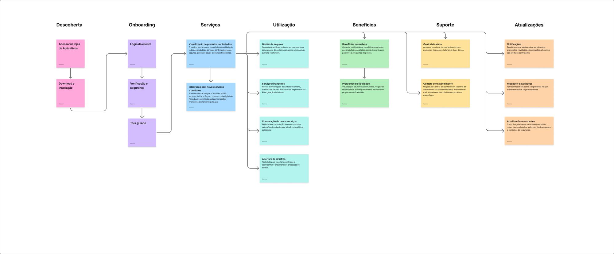
The map decides what reaches the home screen
The map that opens this page is not decoration. It is the instrument I use to argue about priority without arguing about taste. Seven phases, from discovery in the app stores through to updates, and every service appears in the phase where the person needs it, not in the phase where the team that owns it wants to appear.
In a large company's app, every department wants its product on the home screen. Insurance management, financial services with cards, bills and instant payments, buying a new service, opening a claim, benefits, the points programme, the help centre and the support channel. All of it is legitimate and all of it fits on the map, but none of it fits on the first screen at the same time.
The question stops being what goes on the home screen and becomes which phase the person is in when they open the app. Somebody with a request in progress is not in the buying phase.
The wrong question becomes the right one
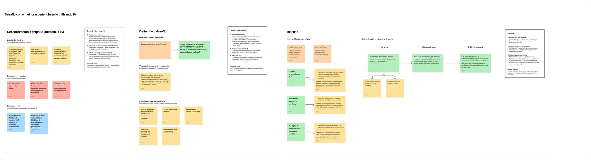
The challenge that arrived was improving customer service using AI, and that statement decides nothing. It accepts a chatbot on the home screen, a rewritten help centre and a smaller support team as equally good answers. So the first thing was rewriting the statement.
How do we improve customer service?
Three things in the same place: people cannot get a fast answer to a complex problem, the support team carries a high operational load, and the service they receive is too generic for somebody who expected to be recognised.
The statement itself. It became a different question: how can AI anticipate what the person needs and deliver immediate, personalised, effective service. With that, an answer that is merely faster stopped counting as a solution.
The core value was written in one sentence, so it would not drift later: automated service that understands the person's context, settles the question quickly and anticipates what comes next. The indicators came with it, because a statement without a metric turns back into conversation. Resolution rate with no human involved, average time to a solution, satisfaction measured by CSAT and NPS, the drop in demand for human support, and operational cost.
Ideation left three tracks, and they are not three features. They are three moments. The chatbot takes the first contact, escalating to a human when the case is complex and resolving the simple ones outright. Post service sends material on the same subject back, so the next question does not become another ticket. And monitoring looks for behaviour patterns that signal churn or dissatisfaction, to act before the complaint exists.
What the vision became in the interface
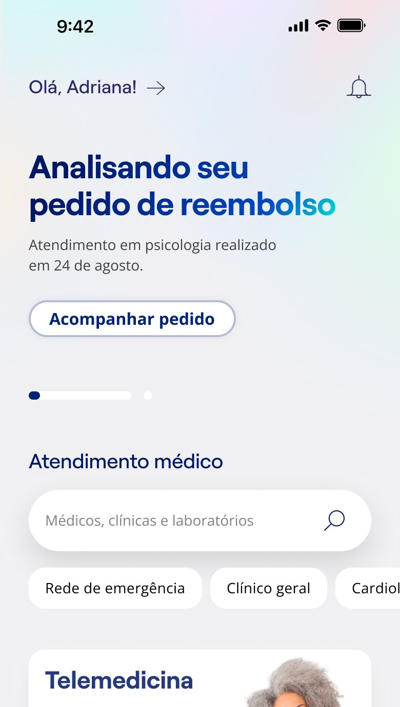
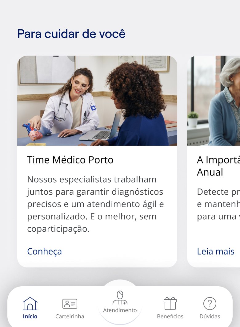
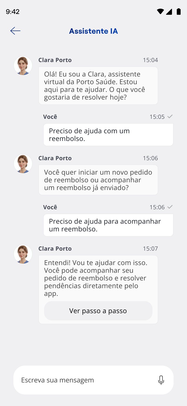
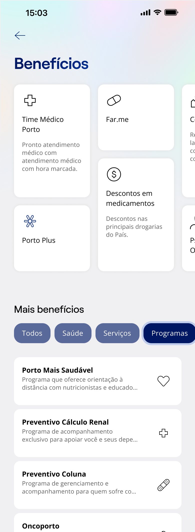
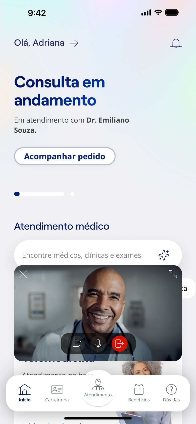
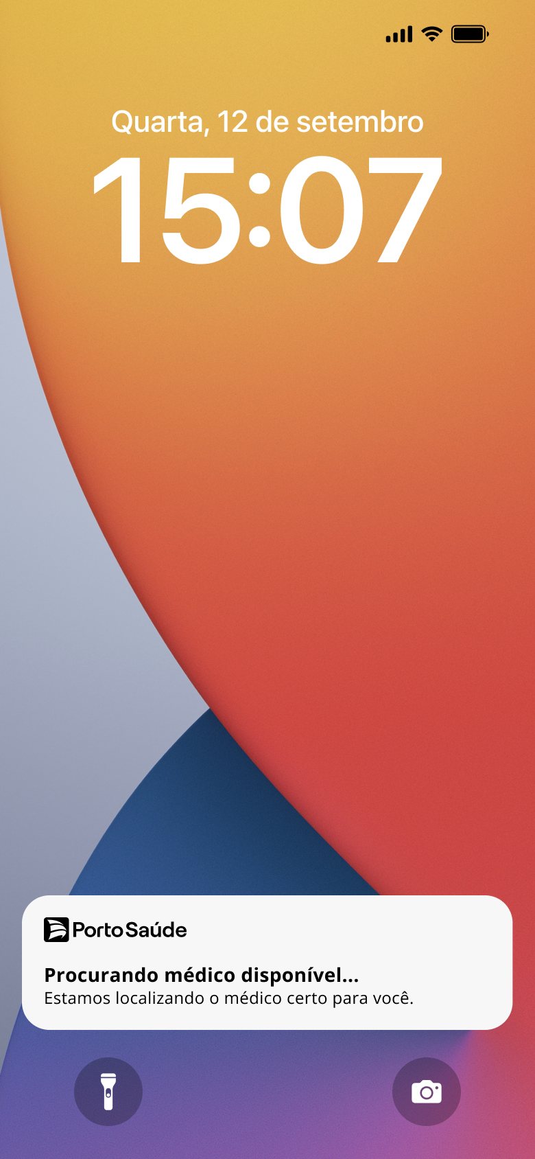
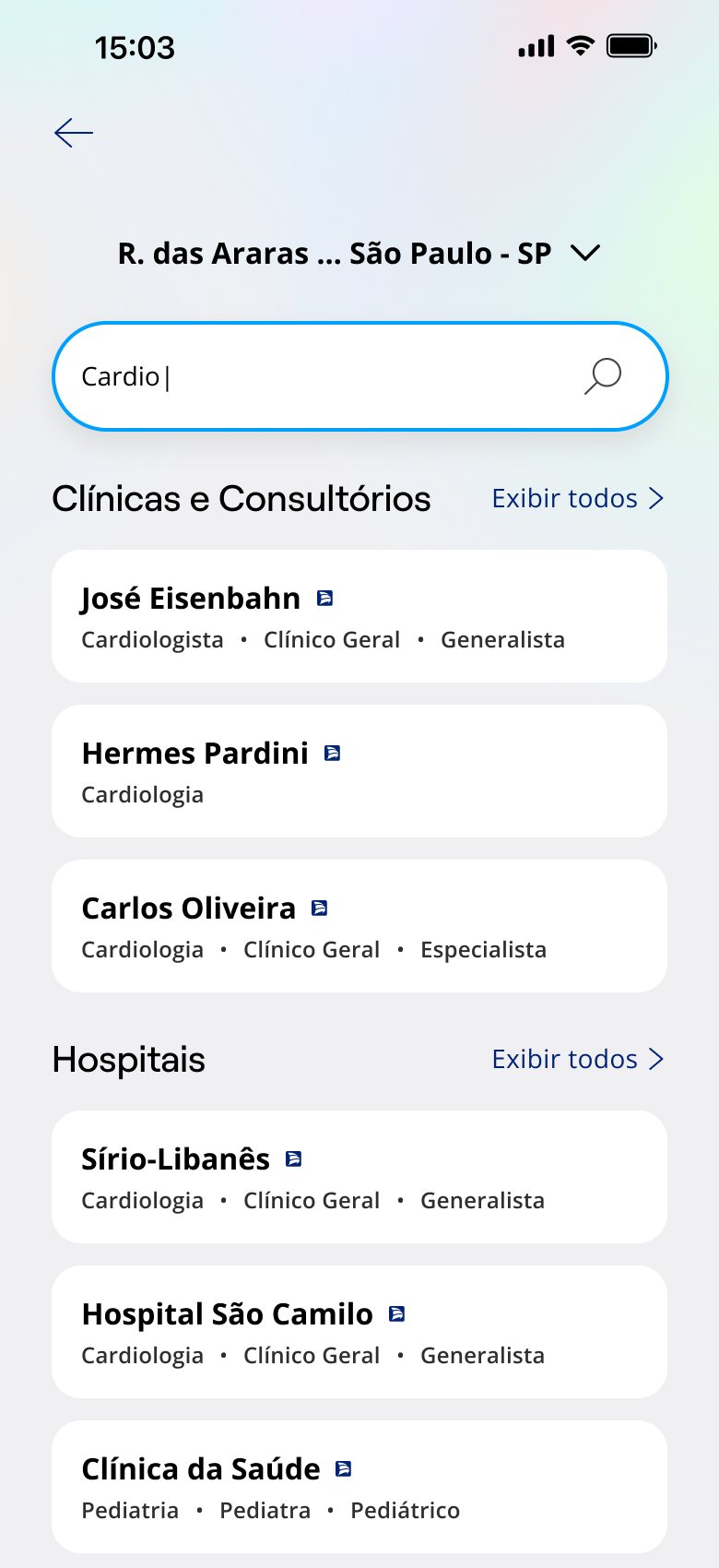
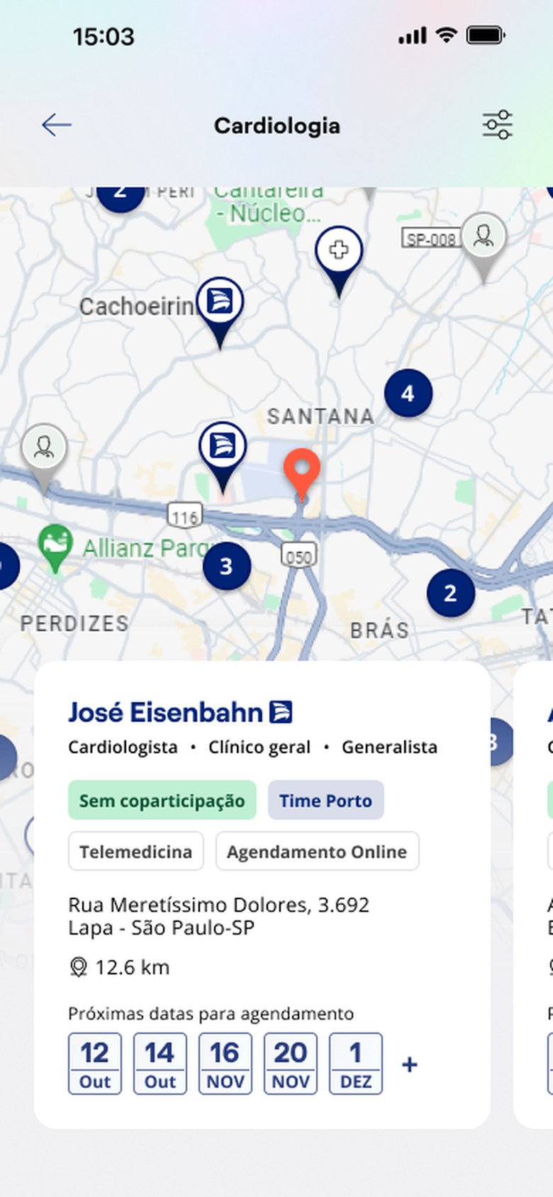
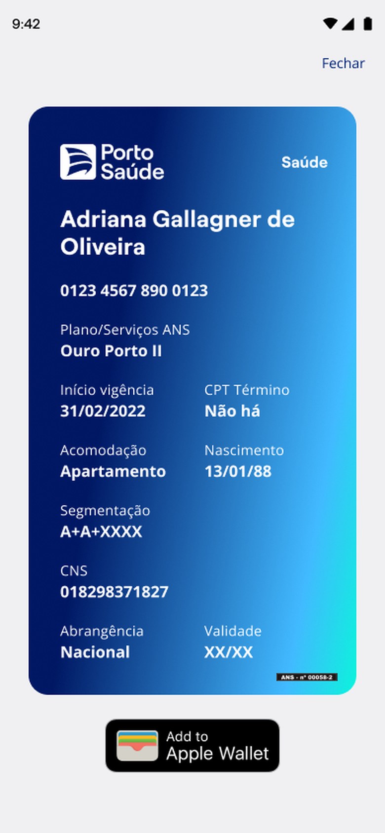
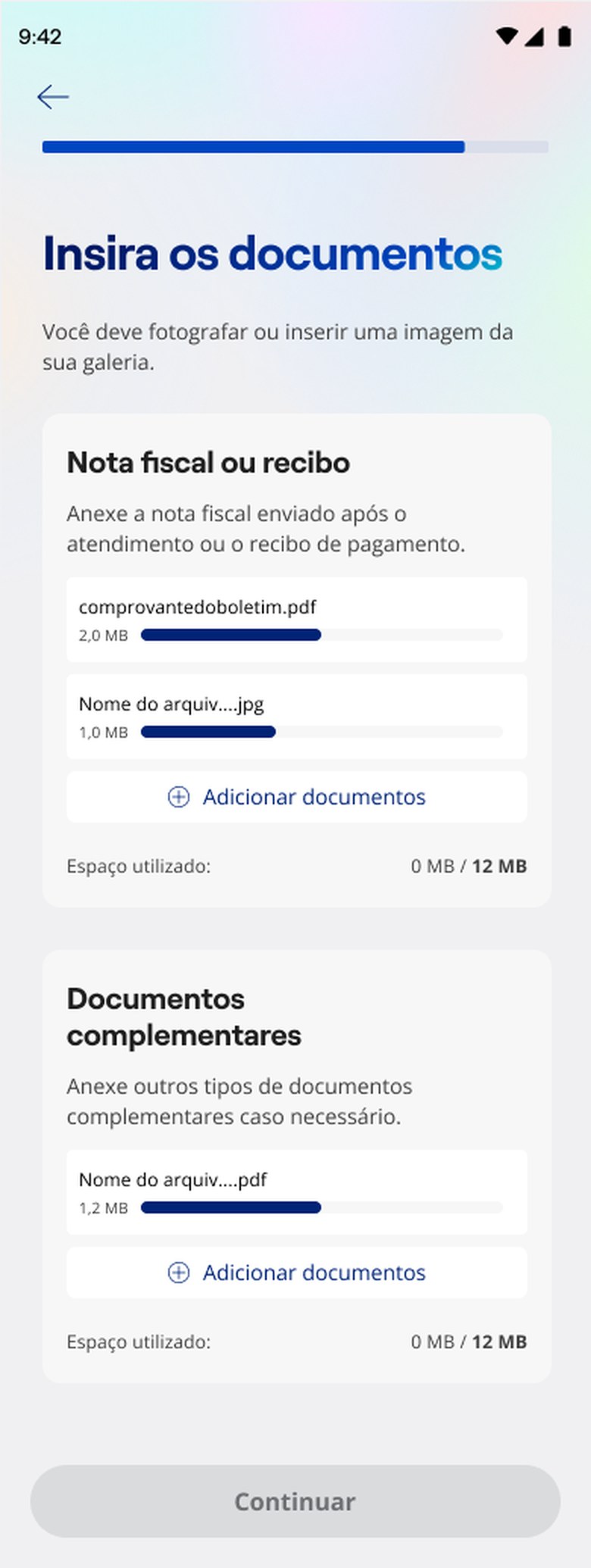
The 2025 brief was moving from a health insurance app to an app that takes care of health. Put like that it is a slogan. What turns it into a product are small, checkable decisions, and they are in the screens below.
The home opens with the request in progress, before the menu, because somebody with an open request only wants to know about that request. The Taking care of you block swaps policy logic for health and is what names the whole shift. Telemedicine runs in a floating window, so the consultation does not hijack the device. The search for a doctor stays visible on the lock screen, because that search takes time. And sending a document for reimbursement keeps the button locked until the attachment arrives, which is the honest way to prevent an incomplete submission in a product where a missing document turns into a denial.
One number that went up and one vision that did not pass
A note on method about that number, because this is where a reviewer pokes. The NPS comes from the app's own tracking, inside the company, and the report stayed there. I am not going to reconstruct the cut or the measurement window from memory, so treat 35 to 61 as what it is, the movement the company recorded over the period of the home, search and claims redesign.
The second part is less comfortable and I keep it online on purpose. The vision for the new app was not approved, and the company moved on with another consultancy. The screens on this page are exactly the delivery that did not pass.
Design work that only surfaces when it was approved is not a portfolio, it is a shop window. What I can defend in an interview is the decision, and it stays the same whether it passed or not.
The statement is the part that decides the most
The most useful thing about those three years was not a screen. It was seeing how much a badly written statement costs later. Improve customer service accepts any answer, including the bad ones, and the team spends months proving their answer fits the statement. Anticipate what the person needs before they ask for help refuses almost everything, and what survives already arrives with its indicator attached.
I carry that into the other products. Before designing, I rewrite the request until it is narrow enough to kill alternatives.